|
Research Ideas and Outcomes :
Policy Brief
|
|
Corresponding author: Carol X Garzon-Lopez (c.x.garzon@gmail.com)
Received: 31 Jan 2017 | Published: 06 Feb 2017
© 2017 Duccio Rocchini, Carol X Garzon-Lopez
This is an open access article distributed under the terms of the Creative Commons Attribution License (CC BY 4.0), which permits unrestricted use, distribution, and reproduction in any medium, provided the original author and source are credited.
Citation:
Rocchini D, Garzon-Lopez CX (2017) Cartograms tool to represent spatial uncertainty in species distribution. Research Ideas and Outcomes 3: e12029. https://doi.org/10.3897/rio.3.e12029
|
|
Abstract
Species distribution models have become an important tool for biodiversity monitoring. Like all statistical modelling techniques developed based on field data, they are prone to uncertainty due to bias in the sampling (e.g. identification, effort, detectability). In this study, we explicitly quantify and map the uncertainty derived from sampling effort bias. With that aim, we extracted data from the widely used GBIF dataset to map this semantic bias using cartograms.
Keywords
Uncertainty, species distribution models, cartogram, GBIF, sampling effort
Overview
To assess bias related to sampling effort, we use one of the most widely used datasets for studying biodiversity at large spatial extents: the GBIF dataset. GBIF data comprise a large range of species occurrence observations collected using a variety of sampling approaches. The data span from well-established plot censuses to direct observations collected during field trips. Consequently, some of the data points are at the centre of sampled grids (each point comprises the species located at a specific-size quadrant) or correspond to a single observation of at least one individual of the same species. These differences also depend on the methodologies used to observe/record occurrences per taxon. Plots and transects are common practices in vegetation censuses, while transects, point counts, and live traps are preferred in the case of animals. Moreover, the variation in factors—such as per country biodiversity monitoring schemes, funding schemes, focal ecosystems, and accessibility to remote areas—add another source of variation, especially at multinational scales (
We aimed to quantify and map the uncertainty derived from variations in observations due to differences in sampling efforts. Cartograms were used to illustrate uncertainty, in which the shape of objects (countries) correlates with the level of uncertainty. Cartograms build on the standard treatment of diffusion, in which the current density is given by:
\(J = v(r, t) \rho(r, t)\)
where \(v(r, t)\) and \(\rho(r, t)\) are the velocity and density at a given position (r) and time (t) (
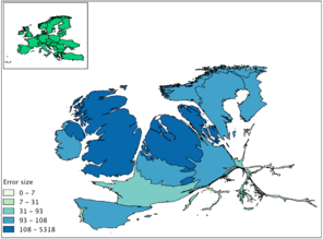
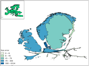
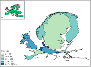
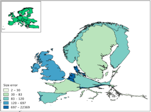
Cartogram of species occurrences. Extracted from GBIF data (http://www.gbif.org/). Error size above 100 indicates oversampling and error size below 100 indicates the country is under-sampled.
b: Fungi
c: Animals
d: All taxa
Expected advantages
- Cartograms facilitate the visualization of spatial uncertainty in the results by changing the size of the polygons based on the density of information contained (number of observations, variation, etc.).
- The generated maps show differences in species observations per country across all taxa, including some of the main taxonomic groups.
- The cartograms were developed using free and open source software (ScapeToad), and are easily reproduced. The only data required is a shapefile with polygons (e.g. countries) and a corresponding value per polygon (e.g. number of observations) to obtain the cartogram.
- Cartograms are intuitive: the shape and area of the countries derives from the difference between the actual size of the country and the size of the sampling (e.g., the number of observations). Hence, smaller areas which are oversampled will look bigger in the cartograms, with a high oversampling value, while bigger oversampled areas will have a high value but a lower relative size. The method thereby directly accounts for the area effect, i.e. the size of each country, on the final sampling effort. For instance, the Netherlands and Sweden are both oversampled, but the latter occupies a bigger surface area. Hence in the final cartogram (e.g. Fig.
1 a ), oversampling of Denmark is enhanced by both values (colour) and shape (final occupied areas).
Applicability
In the proposed method, uncertainty is shown at the country level and corresponds with the deformation of the original country area. In other words, countries bigger than their original size require strategies to reduce the effect of oversampling on the products derived from the GBIF data, while countries smaller than their original sizes require more sampling effort. Future developments will include the visualization of species distribution model predictions combined with the maps of uncertainty presented here.
References
- New measures for assessing model equilibrium and prediction mismatch in species distribution models.Diversity and Distributions19(10):1333‑1338. https://doi.org/10.1111/ddi.12100
- From The Cover: Diffusion-based method for producing density-equalizing maps.Proceedings of the National Academy of Sciences101(20):7499‑7504. https://doi.org/10.1073/pnas.0400280101