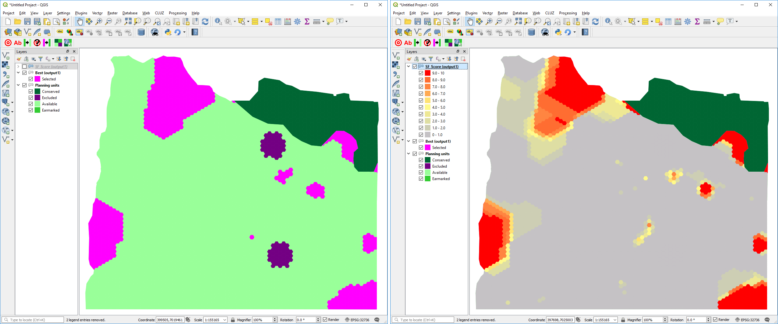
Screenshots from QGIS showing the two Marxan outputs displayed in CLUZ. The map on the left shows the best portfolio of planning units selected by Marxan, while the map on the right shows the selection frequency score of each planning unit based on running Marxan ten times, with planning units in red being selected in every one of the ten Marxan runs.